Creating a compelling layout photo album requires more than simply arranging pictures on pages. Whether you're offering personalised print products to customers or designing albums for professional purposes, the strategic placement of images transforms a collection of photographs into a meaningful narrative. Modern photo album design blends artistic vision with technical precision, ensuring every spread delivers visual impact whilst maintaining coherence throughout the entire album.
Understanding Visual Hierarchy in Photo Album Design
Visual hierarchy forms the foundation of effective layout photo album creation. This principle determines how viewers' eyes move across each page, guiding them through the story you're telling. Strong hierarchy establishes focal points, creates rhythm, and ensures that important moments receive appropriate emphasis.
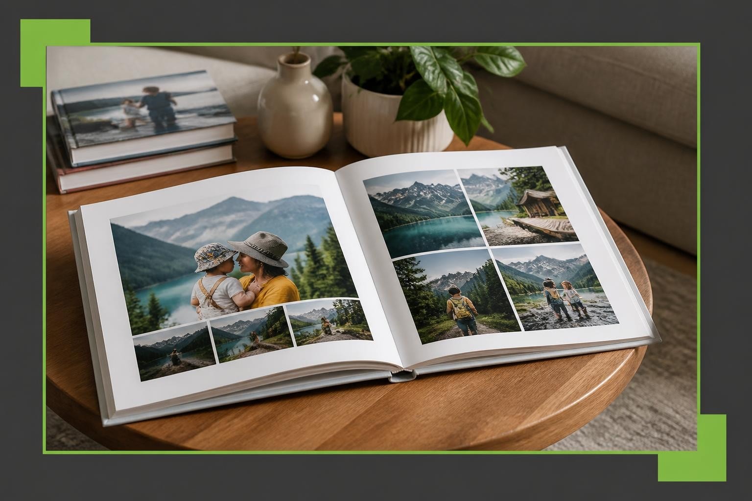
When designing album layouts, consider which images deserve prominence. Hero images-typically full-bleed spreads or large single photographs-should anchor key moments such as important events or emotional highlights. These anchor images establish the visual tone and pace for surrounding pages.
Balancing Scale and Proportion
The relationship between image sizes on a spread creates visual interest and prevents monotony. A well-designed layout photo album incorporates varied image sizes to maintain viewer engagement.
Effective size variation techniques include:
- Using one dominant image paired with smaller supporting photographs
- Creating symmetrical layouts with equally-sized images for formal presentations
- Implementing asymmetrical arrangements for dynamic, contemporary feels
- Reserving full-page spreads for the most impactful moments
| Layout Type | Best Use Case | Visual Impact |
|---|---|---|
| Single Full-Bleed | Landscape vistas, group photos | Maximum drama |
| Two-Up Split | Before/after, complementary scenes | Balance and comparison |
| Grid (4-6 images) | Event sequences, detail shots | Comprehensive storytelling |
| Asymmetric Mix | Editorial feel, varied subjects | Contemporary energy |
The spacing between images-known as gutters-also affects readability. Consistent gutters create professionalism, whilst varied spacing can introduce dynamic tension. Understanding fundamental design principles helps establish the visual framework that supports your creative vision.

Strategic Image Grouping and Sequence
Thoughtful image organisation separates mediocre albums from exceptional ones. When you layout photo album pages, consider how images relate to one another thematically, chronologically, or visually. Strategic grouping creates narrative flow that keeps viewers engaged from cover to cover.
Chronological Versus Thematic Approaches
Chronological ordering works beautifully for event albums where time progression matters-weddings, holidays, or project documentation. This approach provides natural structure and helps viewers follow the story intuitively.
Thematic grouping, conversely, organises images by subject, emotion, or visual similarity regardless of when they were captured. This method excels for:
- Portfolio presentations showcasing specific skills
- Year-in-review albums highlighting diverse moments
- Artistic projects where mood trumps timeline
- Mixed-event compilations
When working with creative photo books, consider mixing both approaches. Perhaps organise the album chronologically whilst grouping similar subjects within each time period for maximum coherence.
Managing Page Turns and Reveals
The physical act of turning pages creates opportunities for dramatic reveals and storytelling beats. Professional layout photo album design anticipates these moments, using them to enhance narrative impact.
Page turn strategies include:
- Positioning climactic images on right-hand pages for immediate impact upon turning
- Using left pages to build anticipation through complementary or sequential images
- Creating visual continuity across spreads through colour, subject, or composition
- Saving strongest moments for right-hand pages, which receive longer viewing time
Consider pacing throughout the album. Not every spread requires maximum visual intensity. Quieter pages featuring single images or generous white space provide breathing room, making impactful spreads more powerful by contrast.
Orientation and Format Considerations
Album orientation significantly influences how your layout photo album communicates its story. The format you choose should complement the majority of your images whilst supporting the album's overall purpose.
Landscape, Portrait, and Square Formats
Landscape albums suit horizontal photographs-scenic vistas, group photos, or panoramic shots. The wide format creates cinematic spreads and works particularly well when images span both pages. This orientation provides maximum flexibility for varied layouts.
Portrait orientation accommodates vertical images without excessive cropping. Fashion photography, standing portraits, and architectural shots often benefit from this format. Portrait albums create an elegant, sophisticated aesthetic appropriate for formal presentations.
Square formats offer versatility, accommodating both horizontal and vertical images with minimal white space. The balanced proportions create contemporary appeal and work beautifully for social media-oriented content or Instagram-style compilations. Different album orientations each serve specific photographic styles and viewer experiences.
| Orientation | Dimensions (typical) | Ideal Image Types | Design Flexibility |
|---|---|---|---|
| Landscape | 12×9, 14×11 inches | Horizontal, panoramic | Excellent for spreads |
| Portrait | 9×12, 11×14 inches | Vertical, standing shots | Formal presentation |
| Square | 10×10, 12×12 inches | Mixed orientations | Balanced versatility |
When you layout photo album pages, ensure your format choice aligns with your image collection. Forcing portrait images into landscape albums creates excessive empty space, whilst landscape photos in portrait albums may require severe cropping.

White Space and Breathing Room
White space-or negative space-represents one of the most underutilised yet powerful elements in layout photo album design. Far from being wasted space, these areas guide viewer attention, reduce visual clutter, and create sophisticated layouts that communicate professionalism.
Generous margins around images prevent layouts from feeling cramped or overwhelming. White space provides visual rest between photographs, allowing each image to be appreciated individually before moving to the next.
Intentional Spacing Techniques
Effective white space applications include:
- Surrounding hero images with generous borders to emphasise their importance
- Using consistent margins throughout to create visual rhythm
- Implementing asymmetric spacing for contemporary, editorial aesthetics
- Balancing busy, multi-image spreads with simpler single-image pages
Modern photo album software solutions enable precise control over spacing and margins. Taopix’s online designer offers flexible tools that allow businesses to create fully customisable layouts with exact spacing specifications, ensuring professional results consistently.
The gutter-the centre fold where pages meet-requires special attention. Avoid placing important image elements or faces directly in the gutter, as the binding may obscure or distort them. Leave adequate space between the gutter and image content to ensure nothing important gets lost in the fold.
Colour Harmony and Visual Cohesion
When you layout photo album pages, colour relationships between adjacent images significantly impact visual flow. Jarring colour transitions disrupt the viewing experience, whilst thoughtful colour progression creates harmony that guides viewers smoothly through your album.
Creating Colour Flow
Strategies for colour cohesion include:
- Grouping images with similar colour palettes on the same spread
- Using transition pages with neutral tones between dramatically different colour schemes
- Arranging images to create gradual colour shifts across multiple spreads
- Balancing warm and cool tones within individual layouts
Background colours and page treatments also influence overall harmony. White or cream backgrounds suit most applications, providing neutral canvases that showcase photographs without competition. Coloured backgrounds work selectively-perhaps matching a wedding theme or brand identity-but require careful consideration to avoid overwhelming images.
For businesses offering personalised products to customers, providing colour harmony guidance helps ensure satisfying final products. Events featuring interactive photo experiences, such as those provided by Pixilated Photo Booth, generate diverse images that benefit from thoughtful colour organisation in album layouts.
Typography and Text Integration
Most layout photo album designs incorporate text-captions, dates, quotations, or descriptive passages. Typography choices and text placement require the same careful consideration as image arrangement to maintain visual balance.
Font Selection and Hierarchy
Typography best practices include:
- Limiting font families to two maximum-one for headings, one for body text
- Ensuring adequate size for readability (minimum 10-12pt for body text)
- Maintaining consistent spacing between text and images
- Using subtle colours that complement rather than compete with photographs
Text placement significantly affects layout success. Captions positioned consistently-perhaps always below images or in specific corners-create predictability that viewers appreciate. Varying text placement randomly appears amateurish and disrupts visual flow.
Consider text-free spreads for the most impactful images. Powerful photographs often communicate more effectively without accompanying words, allowing viewers to interpret and respond emotionally without textual guidance.

Technical Considerations for Print Quality
Professional layout photo album creation extends beyond artistic arrangement to encompass technical specifications that ensure print quality matches design intent. Understanding resolution requirements, colour spaces, and bleed areas prevents disappointing final products.
Resolution and Image Quality
Critical technical specifications include:
| Specification | Minimum Requirement | Optimal Target | Impact if Inadequate |
|---|---|---|---|
| Resolution | 150 DPI | 300 DPI | Pixelation, blur |
| Colour Space | sRGB | Adobe RGB | Colour shift |
| Bleed Area | 3mm | 5mm | White edges |
| Safe Zone | 5mm from edge | 10mm from edge | Cropped content |
Images should extend beyond the page edge (bleed) when designing full-bleed layouts to prevent white borders if slight trimming variations occur during manufacturing. Conversely, maintain safe zones-areas free from critical content-near edges and gutters to prevent unwanted cropping.
Modern photobook software solutions handle many technical requirements automatically, but understanding these principles ensures you make informed decisions when laying out your album. Taopix’s technology enables businesses to integrate quality controls within their workflows, ensuring customers achieve professional results consistently.
Multi-Page Spread Strategies
Whilst individual page layouts matter, thinking across multiple spreads creates more sophisticated storytelling. Professional designers view albums as continuous narratives rather than isolated pages, using multi-spread strategies to build momentum and emotional resonance.
Building Narrative Arcs
Consider your album's overall structure in three acts:
Opening spreads establish tone, introduce subjects, and set expectations. These pages should intrigue viewers and encourage continued exploration. Strong opening images combined with generous white space create inviting entry points.
Middle spreads develop the story through varied pacing-mixing dense, multi-image layouts with simpler single-photograph pages. This variation maintains interest whilst thoroughly documenting your subject.
Closing spreads provide resolution and emotional payoff. Final pages often feature contemplative single images or carefully selected highlight montages that encapsulate the entire album's essence.
When businesses layout photo album products for customers, encouraging this narrative thinking elevates final products beyond simple photo collections into meaningful keepsakes that recipients treasure.
Customisation and Personalisation Options
Modern consumers expect personalisation beyond basic image selection. Offering extensive layout photo album customisation options differentiates your service and increases customer satisfaction.
Customisation opportunities include:
- Multiple template options catering to different aesthetic preferences
- Adjustable layouts allowing image repositioning and resizing
- Background pattern and colour selections
- Embellishment options such as borders, frames, or decorative elements
- Text customisation including fonts, colours, and positioning
Balancing customisation with guidance prevents overwhelmed customers. Providing well-designed templates as starting points, whilst allowing modifications, delivers both creative freedom and professional results. Flexible workflows enable businesses to offer extensive customisation whilst maintaining quality standards.
Common Layout Mistakes to Avoid
Understanding frequent design pitfalls helps you layout photo album pages more effectively, whether creating albums personally or guiding customers through the process.
Overcrowding and Visual Clutter
Mistakes that compromise layout quality:
- Excessive images per page – More isn't better; overcrowded spreads overwhelm viewers
- Inconsistent spacing – Random gaps between images appear unprofessional
- Poor cropping decisions – Cutting off important subject elements undermines image impact
- Neglecting image quality – Including low-resolution photographs degrades overall presentation
- Ignoring the gutter – Placing faces or critical details in the fold creates frustration
Professional layout photo album design requires discipline-sometimes removing good images to improve overall flow. Each photograph should earn its place through relevance and quality, not sentimental attachment alone.
Maintaining Consistency Without Monotony
Consistency creates professionalism, but excessive uniformity becomes boring. Striking the right balance requires thoughtful variation within established frameworks.
Use consistent margins and spacing throughout whilst varying the number and arrangement of images per spread. Perhaps establish a rhythm-dense layout, simple layout, medium complexity-that repeats across the album whilst adapting to specific content requirements.
Colour consistency matters too. Whilst individual spreads might feature different palettes, ensure smooth transitions and avoid jarring contrasts that disrupt visual flow unnecessarily.
Software Solutions for Professional Layouts
Creating sophisticated layout photo album designs requires capable software that balances creative flexibility with user-friendly operation. Professional solutions offer templates, customisation tools, and quality controls that ensure excellent results.
When evaluating photobook software for your business, prioritise:
- Intuitive interfaces that customers navigate easily without extensive training
- Flexible templates providing professional starting points with modification options
- Quality validation that alerts users to resolution or technical issues
- Preview capabilities allowing comprehensive review before printing
- Mobile compatibility enabling design work across devices
Businesses seeking to offer photobook creation should consider platforms designed specifically for commercial applications. These solutions integrate with manufacturing workflows, support multiple product types, and scale effectively as your business grows.
Design Resources and Inspiration
Continuous learning improves layout photo album skills. Numerous resources provide design inspiration, technical guidance, and creative strategies.
Professional design tips from industry experts cover essential principles like alignment and spacing. Studying successful layouts helps identify effective techniques you can adapt for your projects.
Consider creating a reference collection-albums, magazines, or digital galleries-that showcase exceptional layout work. Analyse what makes these designs successful, noting how they handle spacing, colour, typography, and image arrangement.
Experimentation remains crucial. Try layouts that push beyond your comfort zone, testing different approaches to discover what resonates with your aesthetic sensibilities and target audience.
Client Communication and Expectations
For businesses offering layout photo album services, managing client expectations ensures satisfaction and reduces revision requests. Clear communication about design processes, timelines, and customisation limitations prevents misunderstandings.
Setting Design Guidelines
Effective client communication includes:
- Providing examples showing what's achievable within your platform
- Explaining technical requirements (resolution, file formats) clearly
- Offering design assistance or consultation for complex projects
- Setting realistic timelines accounting for design, approval, and production
- Establishing revision policies before projects commence
Some clients arrive with specific visions requiring gentle guidance towards technically feasible alternatives. Others need inspiration and creative direction. Adapting your communication style to individual client needs improves outcomes and strengthens relationships.
Seasonal and Thematic Considerations
Layout photo album design often reflects specific themes-weddings, holidays, travel, or family milestones. Each theme suggests particular design approaches that enhance storytelling effectiveness.
Wedding albums typically favour romantic aesthetics with elegant typography, generous white space, and carefully sequenced narratives following the event's natural progression. Formal layouts with symmetrical arrangements suit traditional ceremonies, whilst asymmetric, editorial-style layouts complement contemporary celebrations.
Holiday albums embrace seasonal colours and playful layouts reflecting the joy and energy of travel experiences. These albums often incorporate maps, tickets, or ephemera alongside photographs, requiring layouts that accommodate mixed media elements.
Family year-in-review albums benefit from chronological organisation with monthly or seasonal sections. Consistent layout templates within sections create structure, whilst varying templates between sections maintain visual interest across many pages.
Understanding theme-specific expectations helps you layout photo album pages that resonate emotionally with their intended audience, creating more meaningful final products.
Business Applications and Commercial Opportunities
Beyond personal memory preservation, professionally designed layout photo album products serve numerous commercial applications. Businesses across sectors utilise photo albums for portfolios, marketing materials, client gifts, and corporate documentation.
Commercial album applications include:
- Photography portfolios showcasing professional work to potential clients
- Corporate year books documenting company milestones and achievements
- Real estate presentations highlighting property features and transformations
- Event documentation preserving conferences, launches, or celebrations
- Product catalogues displaying merchandise in appealing formats
For businesses providing photobook solutions, these commercial applications represent significant revenue opportunities beyond consumer markets. Professional clients often order larger quantities, accept higher price points for premium quality, and become repeat customers for ongoing projects.
Offering business-focused features-such as brand customisation, bulk ordering, or approval workflows-positions your service for commercial success. Understanding how layout photo album design serves business objectives helps you develop targeted offerings that meet professional client needs.
Mastering layout photo album design transforms ordinary photo collections into compelling visual narratives that preserve memories and tell meaningful stories. By applying strategic principles around visual hierarchy, spacing, colour harmony, and technical quality, you create albums that engage viewers and stand the test of time. Whether you're developing photobook solutions for customers or designing albums yourself, Taopix provides the flexible software technology and customisable workflows that enable businesses to deliver exceptional personalised print products consistently whilst maintaining professional quality standards throughout the creation process.