
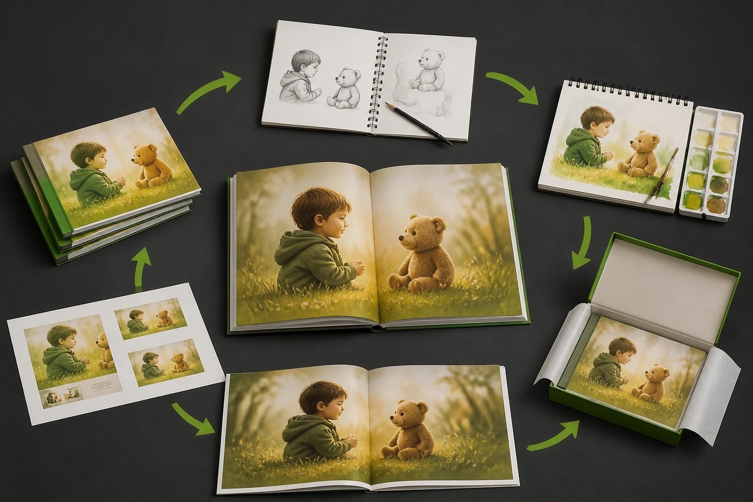
Creating a personalised picture book represents one of the most rewarding creative endeavours for authors, illustrators, parents, and businesses alike. Whether you're crafting a children's story, documenting family memories, or developing branded content for young audiences, the ability to design your own picture book opens up endless possibilities for storytelling and connection. With modern software solutions and digital design tools, the process has become more accessible than ever, allowing creators to bring their visions to life with professional-quality results. This comprehensive guide explores every aspect of picture book design, from initial concept through to final production.
Understanding Picture Book Fundamentals
Picture books follow specific conventions that have evolved over decades to suit young readers' attention spans and cognitive development. The standard picture book typically contains 32 pages, though variations of 24, 28, 40, or 48 pages are also common. This page count isn't arbitrary-it relates to how printing presses fold and bind signatures of paper most efficiently.
When you design your own picture book, you must consider the fundamental relationship between text and illustration. Unlike novels or illustrated chapter books, picture books rely on a delicate balance where words and images work together to tell the story. Essential picture book design principles emphasise that neither element should be redundant; instead, they should complement and enhance one another.
Page Structure and Pagination
Understanding how pages work together is crucial for effective design. Picture books open right to left (for English-language publications), with the right-hand page (recto) typically receiving more visual emphasis than the left-hand page (verso). This affects how you plan your spreads-the two facing pages readers see simultaneously.
Key pagination elements include:
- Front matter (title page, copyright, dedication)
- Story pages (typically 24-28 pages for the actual narrative)
- End matter (author/illustrator notes, if applicable)
- Inside covers (often used for additional illustrations or endpapers)
The first and last pages of your book carry special significance. Many designers use these for setting the scene or providing emotional resolution that extends beyond the main narrative.

Planning Your Visual Narrative
Before diving into design software, thorough planning ensures your finished product communicates effectively with your target audience. The visual narrative arc in a picture book should mirror the story's emotional journey, with illustrations that build tension, provide comic relief, or offer quiet moments of reflection as needed.
Creating a storyboard or thumbnail sketch of all your pages helps you visualise pacing and flow. This low-fidelity planning stage allows you to experiment with:
- Page turns: Strategic placement of plot revelations or surprises
- Visual rhythm: Alternating between busy and calm spreads
- Character consistency: Ensuring protagonists remain recognisable throughout
- Colour palette: Establishing mood through intentional colour choices
- White space: Balancing illustrated areas with breathing room
Professional illustrators often create a dummy book-a rough physical mock-up that lets you experience the book as a reader would. This tactile approach reveals pacing issues that aren't apparent on screen.
Text Placement Strategies
The placement of text within your illustrations requires careful consideration. Professional picture book design suggests keeping text areas consistent whilst allowing for creative variation that serves the story.
| Placement Option | Best Used For | Considerations |
|---|---|---|
| Top of page | Establishing shots, scene-setting | Allows illustrations to anchor the bottom |
| Bottom of page | Action scenes, character focus | Draws eye downward through illustration |
| Integrated within art | Atmospheric storytelling | Requires careful colour contrast |
| Dedicated text boxes | Information-heavy pages | Maintains readability but may feel formal |
Technical Specifications for Print
When you design your own picture book for physical production, understanding print specifications prevents costly errors and disappointing results. The most common trim size for picture books measures 8.5 x 11 inches (216 x 279mm), though 8 x 10 inches and 9 x 9 inches square formats are also popular choices.
Bleed, Margins, and Gutters
Professional printing requires bleed-the extension of your artwork beyond the final trim edge. Standard bleed measures 3mm (0.125 inches) on all sides. This ensures that slight variations during cutting don't result in white edges on your finished pages. Understanding the gutter-the centre fold where pages meet-is equally critical, as important visual elements or text placed too close to this area may disappear into the binding.
Critical measurement zones:
- Bleed area: Where artwork extends beyond trim
- Trim line: Final page edge after cutting
- Safety margin: Minimum 6mm (0.25 inches) inside trim for essential elements
- Gutter allowance: Additional 6-12mm from centre fold for bound books
Modern photobook software solutions, such as those provided by Taopix, incorporate these technical requirements into their design interfaces, automatically creating appropriate guides and boundaries. This removes much of the guesswork from the process whilst ensuring professional results.
Illustration Approaches and Styles
The illustration style you choose dramatically impacts your book's appeal and marketability. Contemporary picture books showcase an enormous range of artistic approaches, from traditional watercolour and gouache to digital illustration, collage, and mixed media. When you design your own picture book, selecting a style that matches your story's tone whilst remaining within your skill level or budget is essential.
Digital illustration has become increasingly popular, offering flexibility for revisions and easier integration with publishing software. Whether you work in Adobe Illustrator, Procreate, Photoshop, or other digital tools, maintaining consistent resolution is vital. Illustrations should be created at 300 DPI (dots per inch) at final print size to ensure crisp, professional results.
Character Design Consistency
Your main characters need to remain recognisable across all 32 pages, even when shown from different angles or in varying emotional states. Creating character reference sheets before beginning full illustrations helps maintain this consistency. These sheets should include:
- Front, side, and three-quarter views
- Expression studies showing various emotions
- Colour swatches with exact values
- Scale relationships with other characters and objects
- Outfit details and any accessories

Typography and Readability
Font selection significantly influences readability, especially for emerging readers. When you design your own picture book, choose typefaces that are clear, friendly, and appropriately sized for your target age group. Most picture books for children aged 0-8 use font sizes between 16-24 points, depending on the amount of text per page.
Typography best practices include:
- Sans-serif fonts for very young readers (3-5 years)
- Clean serif fonts for early readers (5-8 years)
- Consistent font throughout the book (avoid mixing multiple typefaces)
- Adequate leading (line spacing) for comfortable reading
- High contrast between text and background
Avoid placing text over busy or dark areas of illustrations where readability suffers. If the illustration demands text placement over complex areas, consider adding subtle background shapes or gradients behind the text to maintain legibility.
Layout Design Principles
Effective layout design guides the reader's eye through each spread in a logical, engaging manner. The concept of visual hierarchy-organising elements by importance-applies to picture books just as it does to any graphic design project. Your most important element (usually the main character or crucial action) should dominate the spread, with supporting elements arranged to direct attention appropriately.
Creating Dynamic Compositions
Static, centred compositions can feel monotonous across 32 pages. Varying your layouts keeps readers engaged:
- Rule of thirds: Position key elements along imaginary grid lines
- Diagonal lines: Create energy and movement
- Framing: Use environmental elements to focus attention
- Scale variation: Alternate between close-ups and wide shots
- Asymmetrical balance: Distribute visual weight unevenly for interest
Some spreads might benefit from borderless illustrations that bleed to the edges, creating an immersive experience. Others work better with contained illustrations surrounded by white space, particularly for quieter, reflective moments in your narrative.
Software Solutions for Picture Book Design
Modern software has revolutionised how creators design their own picture books, making professional-quality production accessible to independent authors, small publishers, and businesses offering personalised products. The right software streamlines the entire process, from layout creation through to print-ready file generation.
Professional publishing software offers templates specifically designed for picture books, with built-in guides for bleeds, margins, and gutters. These solutions often include features such as image enhancement, colour correction, and text editing tools that integrate seamlessly with your design workflow. The online designer approach allows for intuitive drag-and-drop functionality whilst maintaining the technical precision required for professional printing.
| Software Feature | Benefit | Why It Matters |
|---|---|---|
| Template library | Speeds up initial setup | Ensures proper specifications from start |
| Layer management | Organises complex pages | Simplifies editing and revisions |
| Colour management | Maintains consistency | Prevents printing surprises |
| Export options | Creates print-ready files | Meets professional printer requirements |
| Collaboration tools | Enables team review | Streamlines approval processes |
Businesses offering customisable picture book services need software that balances creative flexibility with user-friendliness, allowing customers to personalise stories whilst maintaining design quality. This is where comprehensive photobook software solutions prove invaluable, offering white-label customisation options that align with brand identity whilst delivering robust functionality.

Colour Theory and Palette Selection
Colour choices in picture books do far more than make pages attractive-they convey emotion, establish atmosphere, and guide readers through the narrative. When you design your own picture book, developing a cohesive colour palette before beginning illustrations ensures visual consistency and emotional resonance.
Different colours evoke specific psychological responses. Warm colours (reds, oranges, yellows) create energy and excitement, whilst cool colours (blues, greens, purples) suggest calm or melancholy. Successful picture books often employ a dominant colour palette with strategic accent colours for emphasis.
Working Within Print Colour Spaces
Understanding the difference between RGB (screen) and CMYK (print) colour spaces prevents disappointment when your vibrant digital files produce muddy prints. RGB offers a wider gamut of bright, saturated colours that don't translate directly to CMYK printing. Design your illustrations in CMYK from the start, or convert early in the process, checking how colours shift.
Colour workflow considerations:
- Design in CMYK or convert RGB files early
- Calibrate monitors for accurate colour representation
- Request printed proofs before full production runs
- Understand that metallic or fluorescent colours require special inks
- Consider spot colours for specific effects (though this increases costs)
Preparing Files for Professional Printing
The final stage of picture book design involves preparing files that meet professional printing standards. This technical process ensures your creative vision translates accurately to physical pages. Files should be saved as high-resolution PDFs with embedded fonts and images, typically using PDF/X-1a or PDF/X-4 standards.
Most professional printers require spreads (two-page layouts) rather than individual pages, with appropriate bleed extension. However, specifications vary between printers, so always confirm requirements before finalising files. Photobook and print production services often provide detailed specification sheets outlining their exact requirements.
Pre-flight Checking
Before submitting files, conduct thorough pre-flight checks to identify potential issues:
- Verify all images are at least 300 DPI at final size
- Confirm fonts are embedded or converted to outlines
- Check bleed extension on all pages
- Ensure no essential elements fall within margin danger zones
- Verify colour mode (CMYK for print)
- Confirm file naming matches printer specifications
- Test that all pages are in correct sequence
Professional photobook software typically includes built-in pre-flight tools that flag common errors before export, saving time and preventing costly reprints.
Personalisation and Custom Content
One of the most exciting aspects of modern picture book creation is the ability to incorporate personalised elements that make each copy unique. Businesses offering customisable picture books allow customers to insert names, upload photographs, or select from various narrative options, creating one-of-a-kind gifts that resonate deeply with recipients.
When designing templates for personalisation, build in flexibility for variable content whilst maintaining visual cohesion. This requires thoughtful planning around text reflow, image placement zones, and design elements that accommodate different content lengths or image orientations.
Templates for Personalised Albums
Creating effective templates for personalised albums requires understanding common use cases and designing flexible frameworks. Birthday books, family chronicles, holiday memories, and milestone celebrations each benefit from specific layout approaches that accommodate diverse content whilst maintaining professional polish.
Template design principles include:
- Multiple layout options within consistent design language
- Flexible text boxes that accommodate varying word counts
- Image placeholders in multiple aspect ratios
- Colour themes that work with various photograph palettes
- Decorative elements that enhance without overwhelming personal content
Distribution and Production Options
Once your picture book design is complete, you'll need to decide on production methods. Traditional offset printing becomes cost-effective for runs of 1,000 copies or more, offering the lowest per-unit cost and highest print quality. However, this requires significant upfront investment and storage capacity for inventory.
Digital printing and print-on-demand services have transformed independent publishing, allowing for small runs or even single copies without prohibitive costs. This flexibility is particularly valuable for personalised picture books, where each copy differs from the next. Quality has improved dramatically, with many digital printers now producing results comparable to offset printing.
Print-on-demand also eliminates inventory risks, allowing you to offer picture book products without warehousing stock. When integrated with robust photobook software platforms, this creates efficient workflows from design through to fulfilment, enabling businesses to scale personalised product offerings without proportional increases in operational complexity.
Quality Control and Proofing
Never skip the proofing stage when you design your own picture book. Errors that seem insignificant on screen become glaring in print. Request physical proofs before approving large print runs, even if this adds time and expense to your timeline. Digital proofs offer some value but can't replicate paper texture, colour accuracy, or binding quality.
Comprehensive Proof Checklist
Review proofs systematically, checking different elements in separate passes:
- Text accuracy: Read through specifically looking for typos, missing words, or incorrect fonts
- Colour consistency: Compare colours across spreads and against your original files
- Image quality: Examine photographs and illustrations for clarity and sharpness
- Alignment: Verify that gutters, bleeds, and margins are correct
- Page sequence: Ensure pages appear in proper order
- Binding quality: Check that pages lie flat and the gutter doesn't obscure content
Involve fresh eyes in the proofing process. After working intensively on a project, creators often overlook obvious errors that others spot immediately. Professional editors or beta readers provide invaluable perspective, particularly for children's content where age-appropriate language and concepts are crucial.
Creating a professional-quality picture book requires careful attention to design principles, technical specifications, and the delicate balance between text and illustration. Whether you're producing a single personalised gift or developing templates for scalable product offerings, success depends on combining creative vision with practical knowledge of the production process. Taopix offers comprehensive software solutions that streamline picture book creation, providing the tools and flexibility needed to transform your concepts into beautifully printed realities whilst maintaining the professional standards today's market demands.
One response to “Design Your Own Picture Book: A Complete Guide”
[…] a customer visits a platform to design a picture book, a personalisation platform can immediately recognise returning visitors, recall their previous […]