
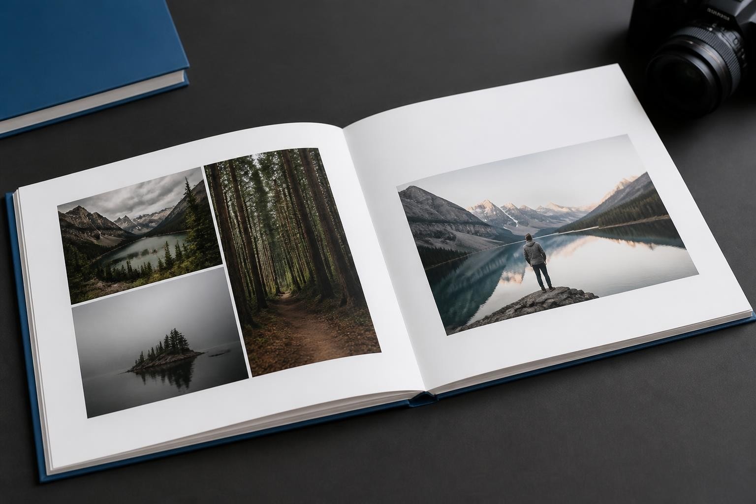
Creating a memorable photo book requires more than simply uploading images and clicking publish. The way you layout photo book pages determines whether your project becomes a treasured keepsake or a disappointing collection of random snapshots. Professional designers understand that thoughtful page composition transforms ordinary photographs into compelling visual narratives. This comprehensive guide explores the principles, techniques, and strategies that separate exceptional photo books from mediocre ones, helping businesses deliver products that customers will cherish for generations.
Understanding Photo Book Layout Fundamentals
The foundation of any successful photo book begins with understanding how visual elements interact on the page. When you layout photo book pages, you're essentially constructing a visual conversation between images, text, and white space. Each element must serve a purpose within the broader narrative structure.
The Role of Visual Hierarchy
Visual hierarchy guides readers through your photo book in a deliberate sequence. Strong focal points capture attention first, whilst supporting images provide context and detail. This hierarchical approach ensures that important moments receive appropriate emphasis without overwhelming the viewer.
Key hierarchy principles include:
- Dominant images should occupy 40-60% of spread real estate
- Supporting photographs work best at consistent secondary sizes
- Caption text should enhance rather than compete with imagery
- White space creates breathing room between visual elements
The most effective layouts balance these components to create rhythm and flow. Readers should move naturally from page to page without conscious effort, guided by intentional design choices rather than random placement.

Grid Systems and Structural Frameworks
Professional designers rely on grid systems to maintain consistency throughout multi-page projects. These invisible frameworks provide alignment points and proportional relationships that create visual harmony. A well-executed grid system allows for creative variation whilst preserving overall coherence.
| Grid Type | Best For | Pages Per Spread | Complexity Level |
|---|---|---|---|
| Single Column | Minimalist portfolios | 1-2 large images | Beginner |
| Two Column | Balanced storytelling | 2-4 medium images | Intermediate |
| Modular Grid | Complex narratives | 4-8 varied images | Advanced |
| Custom Layout | Artistic expression | Variable | Expert |
According to creative layout research, grid-based systems help maintain spatial balance whilst allowing designers to create visual interest through strategic variation.
Strategic Image Placement Techniques
How you position photographs on the page dramatically impacts emotional resonance and storytelling effectiveness. Strategic placement considers not just aesthetic appeal but also narrative flow and reader engagement.
Full-Bleed Versus Bordered Images
Full-bleed layouts extend photographs to the page edge, creating immersive, dramatic presentations. This approach works exceptionally well for landscape photography, architectural shots, and moments requiring emotional intensity. Conversely, bordered images with surrounding white space offer a more refined, gallery-like presentation.
When deciding between these approaches, consider your content's emotional tone. Travel adventures often benefit from full-bleed energy, whilst family portraits may warrant the dignity of carefully framed presentations. Professional photo book layouts demonstrate how full-bleed hero spreads anchor visual narratives effectively.
The Two-Up Spread Strategy
Two-up spreads present complementary images side by side across facing pages. This technique proves particularly effective for before-and-after sequences, comparative shots, or thematic pairings. The key lies in selecting images with compatible compositions that work harmoniously together.
Successful two-up spreads require:
- Similar tonal values to prevent visual imbalance
- Complementary rather than competing focal points
- Consistent editing styles and colour grading
- Thoughtful consideration of the central gutter
The gutter (where pages meet at the binding) presents unique challenges. Important subjects or faces should never fall directly in this area, as they may disappear into the spine or become distorted.
Optimising Photo Density and Page Balance
Determining how many photographs belong on each page represents a critical layout decision. Overcrowding diminishes individual image impact, whilst excessive minimalism may suggest insufficient content. Finding the optimal balance requires understanding both design principles and project objectives.
Recommended Photo Quantities
Research on photo density suggests maintaining clean, organised layouts without overcrowding. General guidelines vary based on book size and purpose:
- 8×8 inch books: 1-3 photos per page for personal albums
- 12×12 inch books: 2-5 photos per page for event coverage
- Professional portfolios: Often 1-2 signature images per spread
- Travel journals: 3-6 images with supporting captions
These recommendations provide starting points rather than rigid rules. The appropriate density depends on image quality, subject matter, and intended viewing context.

Avoiding Common Layout Mistakes
Even experienced designers occasionally fall into predictable layout traps. Common photo book mistakes include inconsistent layouts, which create visual confusion and disrupt narrative flow. Maintaining stylistic consistency doesn't mean monotonous repetition but rather thoughtful variation within established parameters.
Frequent pitfalls to avoid:
- Mixing too many layout styles within single chapters
- Ignoring the relationship between facing pages
- Placing important elements too close to trim edges
- Failing to consider text placement alongside images
- Neglecting white space as an active design element
Professional layout photo book design requires discipline and restraint. Sometimes the most impactful choice involves removing elements rather than adding them.
Advanced Design Principles for Professional Results
Moving beyond basic composition, advanced design principles elevate good photo books to exceptional ones. These techniques require deeper understanding of visual communication and user experience.
Working With White Space
White space (negative space) functions as an active design component rather than empty filler. Strategic use of white space creates emphasis, improves readability, and provides visual rest between intense photographic moments. Top design tips emphasise simplicity and the importance of breathing room around images.
When you layout photo book pages with generous margins and thoughtful spacing, you communicate sophistication and intentionality. Luxury brands understand this principle implicitly, using restraint to convey premium quality.
Typography and Text Integration
Text elements complement visual storytelling when integrated thoughtfully. Captions, dates, and narrative passages should enhance photographs without competing for attention. Font selection, size, and placement all contribute to overall layout effectiveness.
| Text Element | Recommended Size | Placement Strategy | Font Style |
|---|---|---|---|
| Chapter Titles | 24-36pt | Top third of page | Bold, serif |
| Photo Captions | 8-10pt | Below or beside image | Light, sans-serif |
| Body Text | 10-12pt | Dedicated text blocks | Regular, readable |
| Dates/Locations | 7-9pt | Discreet corners | Italic, subtle |
Typography should never overpower imagery. When in doubt, err toward subtlety and let photographs carry the narrative weight.
Tailoring Layouts to Photo Book Types
Different photo book categories demand distinct layout approaches. Understanding these contextual requirements ensures appropriate design choices for each project type.
Wedding and Event Albums
Wedding photo books require elegant, timeless layouts that honour the occasion's significance. These projects typically feature formal portrait pages with classic composition balanced against candid moment spreads showcasing spontaneous emotion.
Chronological organisation works well for event coverage, guiding viewers through the day's progression. Key moments (ceremony, first dance, toasts) deserve prominent placement with supporting images filling contextual gaps.
Travel and Adventure Books
Travel photography thrives in dynamic, energetic layouts that capture destination essence. Wide landscape spreads convey scope and grandeur, whilst detail shots provide intimate cultural insights. Planning photo book layouts becomes crucial for maintaining narrative coherence across diverse locations and experiences.
Geographic organisation by destination creates natural chapter divisions. Opening spreads might feature iconic landmarks, with subsequent pages diving deeper into local culture, cuisine, and personal experiences.

Family and Lifestyle Collections
Family photo books often span extended timeframes, requiring careful chronological or thematic organisation. Growth progression, annual traditions, and milestone moments provide natural structural frameworks.
Lifestyle books benefit from consistent visual treatment that creates brand identity across pages. Families developing annual photo book traditions appreciate recognisable design elements that create continuity across volumes.
Technology and Software Considerations
Modern photo book creation increasingly relies on sophisticated software platforms that balance creative freedom with user-friendly interfaces. Businesses offering personalised print products must provide tools that accommodate both design novices and experienced professionals.
Flexible Workflow Systems
Professional software solutions enable multiple creation pathways. Some users prefer automated layouts with intelligent image placement, whilst others demand granular control over every design element. The most successful platforms accommodate both preferences without compromising either experience.
Taopix exemplifies this balanced approach, providing flexible workflows that adapt to diverse user skill levels whilst maintaining consistent output quality. Their fully customisable user experience ensures businesses can tailor the creation process to specific audience needs.
Template Libraries and Customisation
Pre-designed templates accelerate the creation process without sacrificing individuality. Quality template libraries offer starting points across various styles, themes, and occasions. Users can then customise these foundations to match personal preferences and specific content requirements.
Effective template systems provide:
- Style variety across contemporary, classic, and artistic aesthetics
- Size-appropriate layouts for different book dimensions
- Modular components that allow mixing and matching
- Easy customisation of colours, fonts, and spacing
- Smart guides that prevent common layout errors
The balance between guidance and freedom determines whether users feel empowered or constrained by the creation interface.
Industry Trends Shaping Photo Book Design
The photo book industry continues evolving as technology advances and consumer preferences shift. Understanding current trends helps businesses anticipate customer expectations and deliver relevant products.
Minimalist Aesthetic Dominance
Contemporary design increasingly favours clean, minimalist layouts over busy, heavily decorated pages. This shift reflects broader cultural preferences for simplicity and intentionality. Modern consumers appreciate designs that showcase photography without unnecessary embellishment.
Minimalism doesn't mean boring. Thoughtful use of white space, strategic colour placement, and careful typography create sophisticated results that feel current and timeless simultaneously.
Personalisation and Storytelling
Beyond mere photo compilation, today's best photo books tell cohesive stories with clear narrative arcs. Customers expect tools that facilitate storytelling through thoughtful sequencing, meaningful captions, and thematic coherence.
Businesses successfully implementing personalisation understand that layout photo book software must enable emotional connection between creators and their content. Technology should enhance rather than obstruct the creative process.
Cross-Platform Consistency
Users increasingly expect seamless experiences across devices. Starting a project on desktop, continuing on tablet, and finalising on mobile should feel natural and intuitive. Cloud-based solutions with synchronisation capabilities meet these evolving expectations.
Quality Control and Production Considerations
Even brilliant layouts fail if production quality disappoints. Understanding technical requirements ensures designs translate effectively from screen to print.
Resolution and Image Quality
Proper image resolution prevents disappointing results. Photos should maintain at least 300 DPI at final print size. Upscaling low-resolution images creates pixelation and blur that compromises overall quality.
Resolution guidelines by source:
- Professional cameras: Generally sufficient at native resolution
- Smartphone photos: Check pixel dimensions for large prints
- Social media downloads: Often inadequate for print reproduction
- Scanned images: Scan at 600 DPI or higher for flexibility
Software should alert users to resolution concerns before finalising orders, preventing costly disappointments and customer dissatisfaction.
Colour Management and Consistency
Screen colours often appear more vibrant than printed results. Proper colour management ensures expectations align with deliverables. Professional workflows incorporate colour profiles that accurately represent final output.
Calibrated monitors, soft proofing capabilities, and clear customer communication about colour behaviour all contribute to satisfaction with finished products.
Business Implementation Strategies
Companies offering photo book services must consider both technical capabilities and user experience design. Success requires balancing creative possibilities with accessible interfaces that don't overwhelm inexperienced users.
Streamlined User Journeys
Case studies demonstrate that long-term success depends on intuitive creation processes. Users should accomplish tasks with minimum friction, guided by helpful prompts without excessive hand-holding.
Clear progress indicators, autosave functionality, and helpful tooltips prevent frustration during multi-session projects. The goal involves empowering creativity rather than imposing technical barriers.
Scalable Solutions for Growing Businesses
As operations expand, photo book platforms must scale efficiently without degrading performance. Cloud infrastructure, optimised rendering engines, and efficient asset management become critical considerations.
Businesses entering new markets require software partners capable of supporting growth. International expansion examples illustrate how adaptable technology enables geographic diversification whilst maintaining consistent quality standards.
Mastering photo book layout design requires understanding fundamental principles whilst remaining open to creative experimentation. The balance between structure and spontaneity, guidance and freedom, determines whether projects succeed or disappoint. For businesses seeking to offer exceptional personalised print products, partnering with experienced technology providers makes all the difference. Taopix delivers the flexible workflows and customisable user experiences that enable companies to provide outstanding photo book creation tools, helping customers transform treasured memories into beautifully designed keepsakes.